The Making of a Shirt – Part 4 (Patterns)

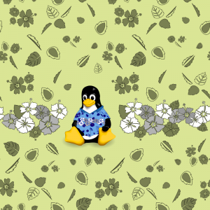
With all my flowers and leaves done, it was time to put it all together into a pattern. I wanted to combine the styles of two Hawaiian shirts that I had. The first has a wide stripe of white and grey flowers around the body, the other has a medium sized picture on the back.

Tiling Tool – Inkscape
Before I could make any pattern, I had to determine which tool to use to make wrap around tiles. These are pattern tiles where the pattern wraps from one side to the other. This allows you to make patterns where you cannot tell where the edge is. When I started working with different tiling tools, I had no idea that Inkscape could do wrap around tiling. But in my searches, I found this you-tube video that showed me how to do it. If you are interested in doing this, make sure you have the latest Inkscape. Older versions might have almost the same menu options, but they don’t really work.

Tileable Patterns in Inkscape

Core Pattern
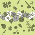
I won’t bore you with all the details. But following the instructions from the video I made my core pattern. This is the pattern that the rest of the shirt developed from.
CT-Shirt-Front

Core Pattern on Casual Tux
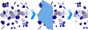
Casual Tux was going to be the picture on the back of my shirt. But I wanted him wearing my ultimate shirt. As you can see, I replaced his original flowers with my core pattern. Using the Inkscape clip function made this very easy. I took my core pattern, layed a piece of Tux’s shirt over it, selected the pattern first, then the shirt piece (so they both are selected). Then in the menu select Object -> Clip -> Set, and you are left with your core pattern, in the shape of the shirt piece.
CasualTux-Hibiscus-trim

Core Pattern on Casual Tux on Core Pattern
Yep, I went there. This final step, for the back of the shirt, ended up being the easiest step of all. I simply put Casual Tux where I wanted him, and removed the flowers from behind him. Easy as could be.

CT-Shirt-Back

Patterns for Fabric
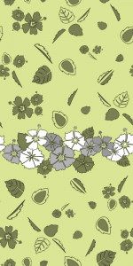
Those of you who have created shirts before have possibly seen the fatal flaw in my pattern. My pattern is square and setup to be tiled. If I want just one stripe across this shirt, with just one Tux on the back, I have to either make my white stripe huge, or add more to my pattern. And so I added more to my pattern. I used the same technique as before to make the wrap around tiles, but this time, I made the height double the width. I was really pleased with the final result.
CT-Shirt-Front-TallCT-Shirt-Back-Tall

Summary
Inkscape is the greatest tool I can think of. With the ability to make wrap around tiles, as well as clip vector graphics, I was able to create the patterns that I needed. I’m all set to create the fabric for my shirt. More on the fabric in my next post.

Part 1
Part 2 – Flowers
Part 3 – Leafs
Part 4 – Patterns
Part 5 – Fabric

The Making of a Shirt – Part 3 (Leafs)

Although Hibiscus flowers look good, they don’t look right without some types of leaves. I did alot of investigation into real Hibiscus leaves, as well as what people use in their pictures. I knew I needed at least three different leaves, but I found I could vary those leaves in more ways than I could the flowers.

Leaf1
My first leave was possibly the hardest. I wanted the leaf to look alot like a real Hibiscus leaf, with lots of ridges on the edges. Those ridges weren’t the hard part. Figuring out how to add leaf veins took me a long time. Eventually I discovered how to make the veins as one long line, and that’s what I ended up with. I rather like it. This is one long line. If you look at the SVG code, it’s just one, very long, line describing the leaf.

CT-Leaf1

Leaf2
My second leaf stems from trials on what to put in the middle of the leaf. I thought of putting a leaf in a leaf, which didn’t really look good. But when I took all the ridges out of the middle leaf, it looked pretty good. I also did the opposite of what I did with the flowers. I started with leaf1, and all it’s outer ridges, and took many of them out and made the few that were left more pronounced. And thus leaf2 was created.

CT-Leaf2

Leaf3
My idea for leaf3 came from a picture of a real Hibiscus flower, and it’s leaves. One of it’s leaves could only be seen from the side, and it looked pretty good. Once I say that, it’s not hard to see what I did. I took my first leave, cut it in half, then imagines what it would look like if half the leaf were pointing directly at me, and the other half was obscured by the first. I found that it gives a very nice variety to my leaves.

CT-Leaf3

Summary
I found that I could do alot more variations with these three formats of leaves than I could with my flowers. They ended up bringing alot of variation and pop to the pattern I was developing. More on the pattern in my next post.

Part 1
Part 2 – Flowers
Part 3 – Leafs
Part 4 – Patterns
Part 5 – Fabric

The Making of a Shirt – Part 2 (Flowers)

CasualTux

Although I love Casual Tux, his flowers are rather simplistic and not Hawaiian. After looking at many Hawaiian shirts I settled on the Hibiscus flower. It was the most common, and looked like I could draw it if I just went one step at a time. I also determined that I needed three different flowers for variety. My final criteria was that it had to be in svg (vector) format. This allows me to scale them to whatever size I need.

Petals
A Hibiscus has five petals, with ridges along the outer edge, and usually a different color in the middle, and a stem coming out of the middle. Most prints ignore the central color, and just have parts taken out of the petal. I like the look of this and decided to go with that. I’ll skip the details, which involved alot of testing different ways to create a petal shape and just go with the first petal.
CT-Hibiskus1-Petal

Stem
The stem I ended up with isn’t what I originally had through most of my work. I originally had the plain stem, and then triangles at the end for the anthers. It looked ok, but just didn’t fit with the rest of the flower. I eventually created what you see now, which has three management points for each anther. It’s harder than the triangles, but looks much better and fits with the rest of the flower style.
CT-Hibiskus1-Stem

Flower1
Putting the flower together sounds easy, just copy five petals and add a stem, but it isn’t. Hibiscus petals do not all look the same, so each one had to be customized. Then the stem, and the petals around it, had to be tweeked so that the stem bent through the gap between two petals. But the final product looked very good.
CT-Hibiskus1

Flower2
My second flower started out just being a copy of the first with a few variations, but then I decided it needed more ridges in the petals. So each petal got three more ridges. But with more ridges, the petals needed to be fatter to show off those fancy ridges. More tweaking with the stem to fit in there, and this is what I got. This is my favorite of the three flowers.
CT-Hibiskus2

Flower3
Flower three has no stem. Looking at other examples I saw several examples of stemless Hibiscus, and they don’t look to bad, just as long as you have normal Hibiscus in the mix. Remove the stem, add even more ridges, make the center cutaways more pronounced, and I got my third flower.
CT-Hibiskus3

Summary
With the ability to rotate, flip, grow and shrink, three different flowers is all you need to create a flower bouquet that your brain thinks is all different flowers. But something was missing. More on my next post.

Part 1
Part 2 – Flowers
Part 3 – Leafs
Part 4 – Patterns
Part 5 – Fabric